Hello there! This is Jeanne from Cozy•Stylish•Chic . For my first contributor post, Julie asked me to talk about High Point Market, the World's Home for World Furnishings, that takes place twice a year in High Point, North Carolina. I could not be more thrilled, as market was such an incredible experience for me. Never mind the tired and blistered feet. I had a renewed sense of what was going on in the world of interior design, and I returned to LA inspired!
COLOR
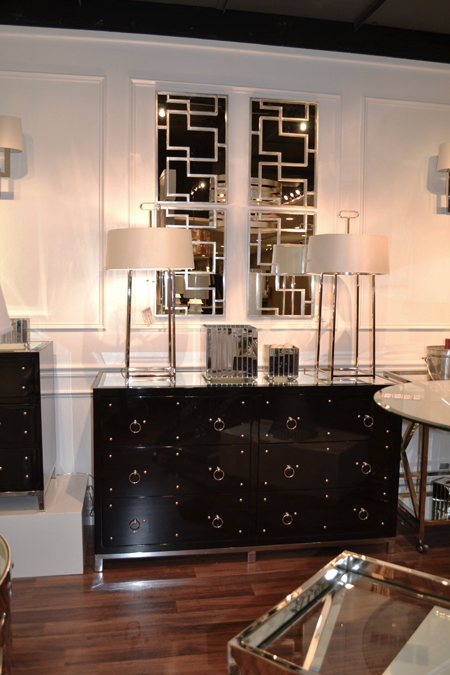
Crisp black and white combinations
"The energizing power of black and white is not confined to apparel," says Ron Fiore, Bernhardt creative director, "Black and white combinations are easy to live with, grounding, and mix with any palette you've established." This held true not only for Bernhardt, but for the majority of lines I came across. |
| Barnsley Dining Table, Bernhardt Interiors |
 |
| C.R. Laine |
According to C.R. Laine, "Black is back" and there is no in between. Here, black and white is paired in stark contrast to one another with a little chartreuse accent to add a little bit of pop.
 |
| Stanley Furniture |
The white lacquered Charleston mirror from Stanley is such a treat when displayed as a group and put against a black background, as seen above.
 |
| Bernhardt Interiors |
 |
| Worlds Away |
Glossy black lacquer against white - a glamorous ensemble from Worlds Away.
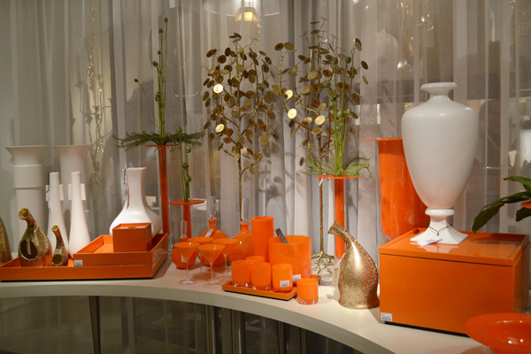
Bright, Saturated Oranges and Corals
Oranges and corals are used as accents in the home either as an accent chair or with accessories to add a touch of color and vibrance to a room.
 |
| Stanley Furniture |
This beautiful coral lacquered bedside table from Stanley Furniture would be equally at home in a traditional setting as it would in a more contemporary or eclectic setting, which is why this is one collection to keep an eye on. Notice how the handles on the bottom drawer are offset - it brings a little whimsy to the table, which I love.
 |
| Studio A |
Bright, glossy accessories from Studio A - used in conjunction with bone and gold, and other neutrals to give a little pop of color.
 |
| Bernhardt |
This look from Bernhardt integrates orange accessories into a classic room of browns with brass trim.
 |
| Bungalow 5 |
Orange and brown lacquered trays and accessories with a nod to classic Hermès.
 |
| Festoni |
TRENDS
Tufting Following in the footsteps of the wildly popular tufted Chesterfield, but now incorporating new contemporary styling, color, and materials. |
| Kim Salmela Atelier |
The color of this chartreuse ottoman from Kim Salmela Atelier lights up the room with its presence.
 |
| Image from Wesley Hall |
Emerald, Pantone's color of the year gives this traditional shape a contemporary twist.
 |
| Image from Wesley Hall |
 |
| Wesley Hall |
Return to Classical Antiquity- Busts and Portraits
Both two and three dimensional busts and portraits were seen throughout market in a range of styles, time periods, and mediums.
 |
| Global Views |
 |
| Stanley Furniture |
 |
| Global Views |
 |
| Woodson and Rummerfield House of Design for Stanley Furniture |
Chinoiserie Chinoiserie has always been a staple of fashionable interior decor. It is a European style which reflects the Chinese artistic influences on the western world. Even though blue and white ginger jars seem to be an ongoing trend for the last 30 years, this season marked a renewed interest in Chinese artistic influences on the west, with styles being pushed to the limit with more flair and sass than before. It marked the return of high gloss lacquer, but this time in bright and saturated colors, the presence of pagoda shapes, hand painted wallpaper, and porcelain reproductions, all hallmarks of classic Chinoiserie.
 |
| Bungalow 5 |
 |
| Bungalow 5 |
 |
| C.R. Laine |
 |
| Four Hands |
 |
| Stanley Furniture |
Other notable trends seen at High Point Market:
•Morocco - a little touch of ethnic, but with a twist of modern
•Hexagons and Honeycomb patterns
•Lucite - either alone or mixed with other materials such as cowhide, leather, and velvet
•Animal Kingdom - antlers, animal heads, hides
•Inlaid bone furniture
•Quatrefoil shapes
I hope you enjoyed my recap of the trends from High Point Market. If you haven't already, I'm sure you'll start to see these same trends pop up all around you. Until next time, ciao!
Unless noted, all images are my own.


Wow, thanks for the review! Love seeing these trends...it's like being in a candy store! I love all these looks and hope they stay for awhile:)
ReplyDeleteBest!
Laura
www.lauradrodesigns.blogspot.com
Thanks for sharing with those of us who could not attend. Love all that orange and the tufting...not big on the busts
ReplyDeleteI love all of the tufting as well! And the black and white - such a timeless trend...it makes me want to do my apartment over in that scheme.
ReplyDelete