Thursday, May 31, 2012

Reader Makeover: DIY Furniture Transformation

Today I'm featuring an awesome DIY furniture makeover submitted by reader Sarah. I love the history behind the piece and think it turned out fabulous. (P.S. Be sure to check out Sarah's blog, Hello Lovely). Enjoy!

Hello Lovelies! I am totally new to the DIY world and used to think just buying it was TOTALLY easier and the way to go...this was before my awesome Husband knocked my socks off and made me a bar. I have been wanting a wooden bar forever, but they are way expensive. We had this hutch in our basement. It was originally my Husband's change table from when he was a baby (awww!) but what do two people without a baby do with a change table??? Turn it into a bar of course! Have a look at the ugly before, let me warn you, this thing was a hot mess....and then the fab after!!!! SO glad I listened to my Hubby! Maybe this girl IS a DIY girl after all! ~ Sarah

Before...an old changing table

After...a stylish bar!

*******

Tuesday, May 29, 2012

Nursery Decor - Tips on Making it Your Own

Hello everyone, it's Erika from small shop! So honored to get to step in for Julie while she is enjoying her new love and life! Since she no doubt has had baby brain the past 9+ months, I thought it might be fun to talk about ideas for personalizing a nursery.
We all want the picture-perfect, off-the-shelf, brand-spanking-new nursery, but sometimes that can look, well, Stepford-ish, right? I collected a few really easy ideas to make sure your wee one's space doesn't look like it was ripped from a catalog.

#1: Adding a few items from your own childhood.
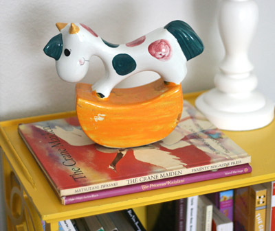
personalizing nursery childhood items rocking horse books
Some of us are lucky that our parents were thoughtful enough to hold onto items from our own childhoods, and many of these items come with fond memories. Why not incorporate a few into your nursery? My husband's mom gave us a rocking horse bank that used to be his, and my parents gave us two books that I loved as a little girl.

#2: Incorporate vintage items.
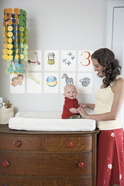
personalizing a nursery: vintage chest changing table by Amanda Kingloff via Parents
Mixing in vintage items is the best way I know how to balance the vast amount of newness we all acquire when creating a nursery — repurposing a vintage chest is so easy! Customize it further with unique knobs. You can often find knobs on Etsy.com or eBay.com for cheap.

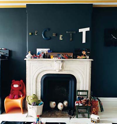
personalizing a nursery: vintage letters by Jenna Lyons in Domino
Combine vintage blocks or letters to spell out your child's name - Etsy.com is so great for this! No one will ever have the same collection.

personalizing a nursery: Barrie Benson in Domino
Hang a vintage chandelier. Always great options at flea markets!

#3: Incorporate a piece of family past and present.
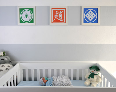
personalizing a nursery: family crests DIY art
My brother and his wife made easy DIY art out of our families' crests.

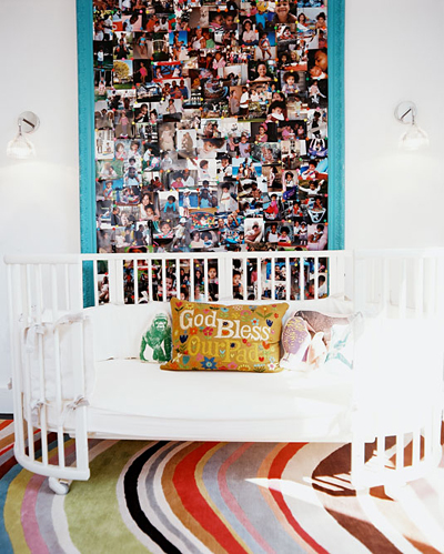
personalizing a nursery: photo wall by Laura Day in Lonny
Love the way Laura Day created a photo collage into one large art piece.

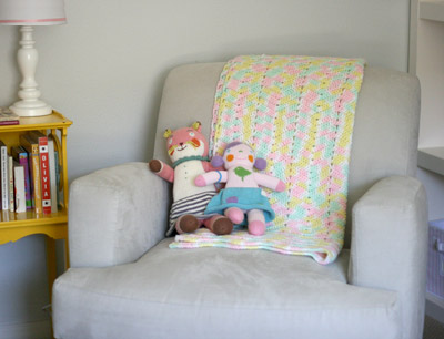
personalizing a nursery: family handmade item
We were lucky to get a crocheted blanket that my grandmother made. It hangs out in a very special nook of our daughter's room.

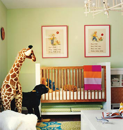
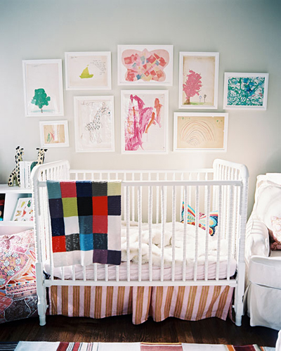
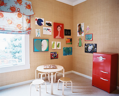
#4: Hang a few pieces of their artwork (or their siblings' ) on the walls.
personalizing a nursery: kids' artwork by Betsy Burnham in Lonny
personalizing a nursery: kid's artwork by Nicole Cohen in RUE
personalizing a nursery: kids' artwork by Palmer Weiss in Lonny
Framed or unframed (using cork or grasscloth as wallpaper), it's a meaningful touch.
Pretty easy, right? I hope you got an idea or two out of this post!
Thanks for having me today Julie!
Images: 1. small shop / 2. Amanda Kingloff in Parents / 3. Jenna Lyons in Domino / 4. Barrie Benson in Domino/ 5. personal photo from my brother / 6. Laura Day in Lonny / 7. small shop, 8) Betsy Burnham in Lonny, 9) Nicole Cohen in RUE, 10) Palmer Weiss in Lonny

Monday, May 28, 2012

Quote of the Week

“Style is knowing who you are, what you want to say,
and not giving a damn.”


- Gore Vidal


Friday, May 25, 2012

For The Love Of Art

It’s a pleasure to be a guest blogger today on Belle Maison. Thank you so much Julie for inviting me to share my love of design with your wonderful readers while you’re on maternity leave. Hi everyone, my name is Typhanie Peterson and you can usually find me over at Shoebox Décor where I discuss small spaces, DIY, art, interior design and a number of other things.

Today I would like to talk about how to make inexpensive artwork look grand in your home. I know many people can’t afford to spend $10,000 on a piece of art by the next up and coming artist, so I like to take affordable pieces and make them look rich. I even like to dabble with art myself. Granted even though it has taken me several years to learn how to draw a stick figure I still treasure my love hate relationship with the arts. With that being said, I might not be the next Von Gogh but I do know a thing or two {maybe three} about having affordable artwork that works for your home.

Here are a few tips to keep in mind when curating and installing artwork in your home. The pieces you pick don’t have to be expensive, just well thought out. To help us visualize using affordable pieces I’ve created some prints we can use to mentally replace the expensive ones we see in the images below. This will help show how the tips help no matter the price of the art. The three prints I have designed for the examples are free* for download and can be found here. They are all 18inx24in and look fabulous inside the Ikea 20 ½ "x28 ¼ " RIBBA frame. Hope you all enjoy them.

1. Color Me Happy   I think one of the most important things to think about when choosing art is color. What colors are in the artwork? Is this going to work with my existing color scheme, or am I going to create a color scheme around the artwork? I love how Ana Cordeiro creates a vibrant chic space with artwork to match. The yellows and pinks found in the piece above the sofa can be seen all around the room. This cohesive scheme allows the eye to move freely around the room while still emphasizing the art. Because the colors work so well together this nice simple print has become a beautiful focal point in the room.
{image via Ana Cordeiro}

2. What’s Your Position?  Now that you have your artwork that blends seamlessly with your color scheme, it’s time to think about where to put it. This is where scale and proportion starts to guide you. For instance, if your favorite piece is too small to anchor your focal wall why not create a collage. The image above shows great positioning of a treasured piece. I love how the designer creates a makeshift triangle for the eye by using the pink flowers to the left and the pink pillow to the right; this forces the eye upward to the crowning piece on the wall. I also love how it’s the only unframed piece in the collage to draw more attention to it. {image via Caitlin Wilson} {I do believe the piece in this room is handmade}


3. Frame It  Speaking of frames, having the right frame around your artwork might be the last piece to the puzzle. If the frame or matting doesn’t match the concept of your piece or space, then everything you’re trying to convey might come off wrong. For example the image above shows how the glossy white opulent frame works perfectly with the stoic aura of Lincoln and the modish entryway. A simple white RIBBA frame can work just the same but taking it up a notch with a heavy stately frame really anchors the room and makes the artwork pop. The artwork I’ve created of Lincoln isn’t as intricate as the one in the room but it would still look right at home in that space because of the rich frame. {image via DC Design House}

There you have it. My three tips for making affordable artwork work in your home. Just remember, it’s not the price that matters but what you do with it that counts…Happy Decorating Everyone! ~Typhanie

*Free for personal use. Commercial use not allowed. ©Typhanie Peterson Design 2012

Thursday, May 24, 2012

Reader Makeover: New Life for an Old Loveseat

Today's reader makeover was sent in by Annie. I love what she's done with an old, dated looking loveseat! It's amazing what a difference new fabric can do for a worn-out piece of upholstery! Have you tried this on any of your own furniture? In Annie's words, here's how she transformed this piece...

I'm an interior designer specializing in textiles in Auckland, New Zealand. I bought the sofa via TradeMe (New Zealands' 'Ebay') and had covered in Quadrille's Lyford Background in Raspberry. I am the distributor for the Quadrille Fabrics range for New Zealand and Australia so the choice of fabric was somewhat predetermined! I had the sad foam seat cushions replaced and plumped with down which I am really pleased with. The upholsterer I use is fabulous and takes so much pride in his work which helps too! This is my favourite part of my design business...clients coming to me and saying they need a new sofa as they can't stand their current one. Most of the time, a good upholsterer to fix the integrity of the sofa and a fresh fabric transforms it into what they wanted. I figure that they bought that sofa in the first place because they liked it once...it may have been because it fit the budget too, but that's where a good upholsterer can make good on cheap cushions and make them comfortable. Thank you also for the opportunity to be a part of this! ~ Annie

Before...

After!


Thanks for sharing Annie! Stay tuned for more reader makeovers on Belle Maison.

******

Tuesday, May 22, 2012

Reader Room Design: A Chic Nursery for Twins

Today I'm excited to share with you an adorable nursery submitted by Niki Rubin, co-owner of Papery & Cakery, for her baby boy and girl twins. With being a new mom myself, I've enjoyed looking at nursery designs over the last 9 months for ideas and inspiration. Niki did a fabulous job and has been so kind to share the details on how she pulled the look together, along with her shopping resources. Enjoy!

"We moved into our new home last summer with our 4 month old boy/girl twins and this was my very first undertaking {with babies you are a lot more of a time crunch to accomplish things so my usual procrastination didn't work, luckily}. The nursery is painted aqua which is not only my favorite color, but also a great neutral shade {I didn't find out the genders so I needed neutral}. The highlight for me are the giant photos above the bed which we framed in the wide white frames. They were taken by our fabulous photographer Shelley Armenio. She also shot the pictures of the room. Both make me smile! So excited for you and your upcoming nursery plans!" ~ Niki


The framed art to the left of Raya's crib are postcards from an Italian paper shop that I matted with papers from Michaels and framed in Ikea frames.

I am into clean lines and crisp white furniture. The cribs are Oeuf Classic Cribs in walnut. The glider is Pottery Barn Baby and the xoxo pillow is from Pottery Barn Teen {sadly discontinued}. The rug is chevron from West Elm. The mobiles above the crib are Pottery Barn baby.

The changing table is Bellini with knobs changed out with turquoise/aqua ones from Anthropologie. The graphic art above the changer and in the bathroom was designed and printed by me. I run a stationery studio and blog in Boca Raton. I also created the tray on the changing table (see below).
The Pear Mirror is Jonathan Adler, representing our "pair" of babies. The sheep mobile above it is from Genius Jones in Miami and is a great distraction for them while getting dressed! 


Both the giant scrabble letters as well as the adorable Whale tissue box are from Etsy.


Thank you for sharing your fabulous nursery with us, Niki!

******

Friday, May 18, 2012

Fashion & Decor: The Two Run Parallel When it Comes to Trends

Today's guest bloggers are Lauren and Marika, or better known as "The Golden Girls," from the fun and fashion forward blog, Golden White Decor. Today they've put together a fantastic post, just for you! Enjoy!

We are so excited about our feature on Belle Maison and cannot thank you enough for thinking of us and asking us to be a part of your beautiful blog! We styled two "modern chic" outfits wearing Kitson, and are thrilled with how they turned out!! What we feel is so important about Fashion and Decor is that the two run parallel when it comes to trends. It is fun for the two creative outlets to play off each other in the ever changing fashion world. Belle Maison is super girly chic. We were inspired by this level of sophistication in the use of colors and patterns. With Spring in full bloom, pops of neon and bright colors are perfect for both home use and apparel. A simple white dress or pillow cover can be brought to life with a pop of color or an innovative pattern. We used this same idea when dressing for the shoot. We wanted to fuse classic tones and cuts with bright girly splashes of color and design. We made it fun by keeping it super girly, super chic, and super fresh much like the design you find at Belle Maison :)! ~ Lauren & Marika

Meet the Golden Girls


Lauren: Dress- Quontum, Jacket- Renzo + Kai, Shoes- Dolce Vita, Clutch- La Cabana Los Angeles, Jewelry- Assorted Kitson 


Marika: Jacket & Pants- Alice & Olivia, Blouse- Tolani, Shoes- Jeffery Campbell, Clutch- La Cabana Los Angeles, Jewelry- Assorted Kitson

{ALL IMAGES PROVIDED BY GOLDEN WHITE DECOR}

Thursday, May 17, 2012

Reader Project: Bright & Fun Girl's Bedroom

As many of you know, I'm taking some time off from blogging and working to spend time with my new baby boy. Last month I asked my readers to submit their own personal home tours, DIY projects, etc. and the response was amazing! Today I'm sharing a young girls bedroom, designed by Mary Olvera. In her own words, here's how Mary pulled this adorable design together...

I'm a HUGE fan of your blog and have been following it for several years now. I'm an interior designer in Lodi, California and have recently finished a room in my own home that I absolutely adore - my 11 year old step daughters bedroom. It was one giant DIY project and completed on a tight budget. I painted all the hand-me-down wood furniture glossy white and replaced the hardware, I made an upholstered headboard for the bed, a nailhead trim inspiration board over the dresser and sewed a couple of custom pillows. I purchased a Bertoia look-a-like chair for the desk from Home Decorators and the sunburst mirror came from Home Goods. The rug and curtain panels are from IKEA and the floating shelves are from Ross. I love the way the room turned out - it's fun and colorful and perfect for a spunky 11 year old girl! ~ Mary 


Thanks for sharing Mary! Stay tuned for more exciting reader projects :)

******