ALL IMAGES VIA TOBIFAIRLEY.COM
Wednesday, December 15, 2010
Designer Spotlight: Tobi Fairley
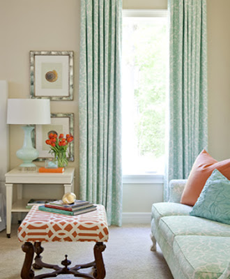
I've been an adoring fan of interior designer Tobi Fairley for some time now. She was selected by Traditional Home Magazine as one of the Top 20 Young Designers in America for 2009 and after browsing through her portfolio, you can see why! I chose the gorgeous project named "Energy House" from her portfolio to share with you, which is exactly that - a stunning home that exudes energy and spirit down to every little detail. The fresh color scheme of crisp white, coral and robins egg blue, accented with pops of turquoise and green, is truly refreshing. This home is right up my alley - simple, modern, classic and livable! If you have time, click here to check out Tobi's entire portfolio (caution - you may get "lost" in the Internet time warp while perusing all of the inspiration!). Enjoy :)
Labels:
Decorating and Design,
Designers,
Inspiration
Subscribe to:
Post Comments (Atom)


love her, a gorgeous house to share - i love the colours and art and frames.... i could go on!
ReplyDeleteA coloured chandelier always draws the eye doesn't it, so daring yet still traditional.
ReplyDeleteI love that large painting above the sofa in the first picture. I have such a love affair with turquoise that each of these rooms was a real treat for me!
ReplyDeleteGosh what a nice home!!!!!!!!!
ReplyDeleteAdooore all the orange books. Making my own Hermes orange book sleeves has made it's way right to the top of my project list!
ReplyDeleteOh! The white, seafoam green and coral are sooooo beautiful together and could be overdone but they are PERFECT!
ReplyDeleteThis is sucha nice color combo, so summery and happy!
ReplyDeleteVery lovely! I like the punch of lime green+ orange!
ReplyDeletehttp://allglamthings.blogspot.com/
thank you for bring us those beautiful things
ReplyDeleteand learn us new ideas for interior decoration.
http://islamicwearguide.blogspot.com/
Love the seashell picture wall...and that deep red chandelier is AMAZING!
ReplyDelete~Jenna, SAS Interiors
www.sasinteriors.blogspot.com
The combination of colours are indeed fantastic! I loved the idea of using a dressing as place just to store things - For this I would require a big walk in wardrobe tough!
ReplyDeleteAmazing portfolio
x
Love the pale blue & orange colour combination. These rooms are all gorgeous xx
ReplyDelete